

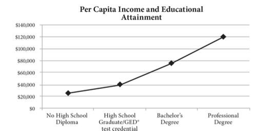
The graph above shows the relationship between average per capita income and educational attainment in the United States. Which of the following statements is best supported by the data?
Explanation
According to the graph, average per capita income increases as educational attainment increases. This is only a correlation, not a causation. By looking at the graph, it is not possible to determine with certainty that one variable caused or didn’t cause the other, eliminate (A) and (B). The graph clearly indicates a positive correlation between two variables, eliminate (D).
Visit our website for other GED topics now!
Related questions