


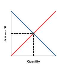
What does the image below illustrate?
Explanation
The image above is a supply and demand curve, used to demonstrate how to find the best price for a good in a competitive market in order to find the economic equilibrium for price and quantity.
Visit our website for other GED topics now!

